
Your best years are now.
The single reference for how OAK looks, sounds and feels — built so designers and AI tools produce work that is unmistakably ours. Colours, type, voice, commerce patterns and the vibe, in one place.
It's not your age. It's your fuel.
OAK is a direct-to-consumer longevity brand. Our hero product is a single-serve creatine stick — a clinical 10g dose, 100% pure, natural lemon — positioned not as gym supplementation but as healthy aging: brain function and strength for people over 50.
The story is a battery metaphor. Creatine restores the cellular ATP your brain and body run on. We speak to capability, not decline — hopeful, specific, backed by research. Never fear-based.
The world is calm, editorial and apothecary-like: deep forest green, warm parchment cream, a refined serif wordmark, botanical imagery and thin line icons. One warm accent — gold — earns its place on ratings and highlights.
The wordmark is the only mark


Green wordmark on cream and light surfaces. Cream wordmark on green and dark surfaces.
Keep clear space of at least the cap-height around it. Never recolour, stretch, add effects, or place on a busy photo without a solid panel behind it.
There is no separate symbol or icon. Set in Passenger Display — the wordmark carries the entire brand personality.
The exact wordmark files in daily use. The logo green is #2E4F3D (brand green) and the cream is #EBE7D7 (Cream 100). Use transparent versions on photography, the solid-background versions where you need a guaranteed contrast panel.

The oak leaf
The hand-painted oak branch printed on the product box — our botanical signature. Use it sparingly as a quiet accent inside green fields or on cream; never recoloured, never busy. It reinforces the apothecary, natural-longevity world.

A warm, monochromatic green world — plus one gold accent
Green-on-cream and cream-on-green are the two contrast modes. No gradients. Gold is the only accent, reserved for ratings and highlights.
Three families, clear roles
A deliberate accent — not every heading. Reserve for the wordmark, large stat numerals and the occasional editorial hero line.
One stick a day. A clinical 10g dose of creatine to support brain function and muscle strength — in a 100% natural lemon flavour. Set deliberately large for a 50+ audience, so it stays effortless to read.
The building blocks of the product page
Warm, natural-light still life
Two registers, both valid. Brand photography is warm, natural-light still life — controlled, editorial, cream and neutral surfaces. UGC is real customers in real homes: honest, unstyled, trust-building. Never cold, never high-saturation, never gradients.
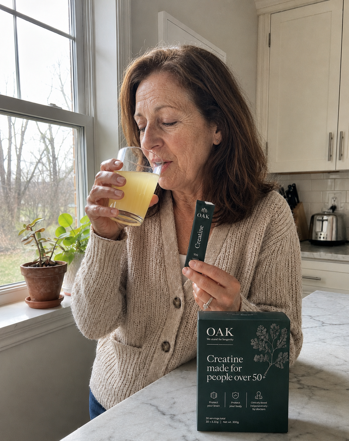
She is who we make it for.
A woman 50+ at her own kitchen counter, taking a sip with the stick and box in frame. Natural light, real home, product clearly present but never staged. This is the reference for generating product-in-use imagery and ads.
Currently live on the product page.
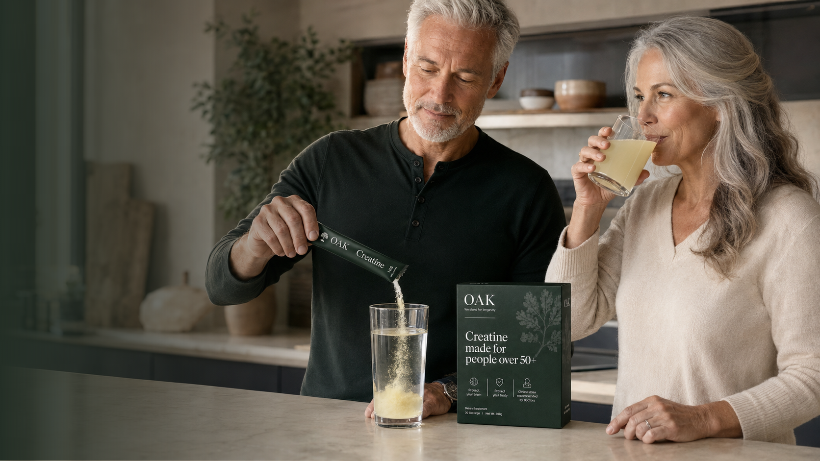

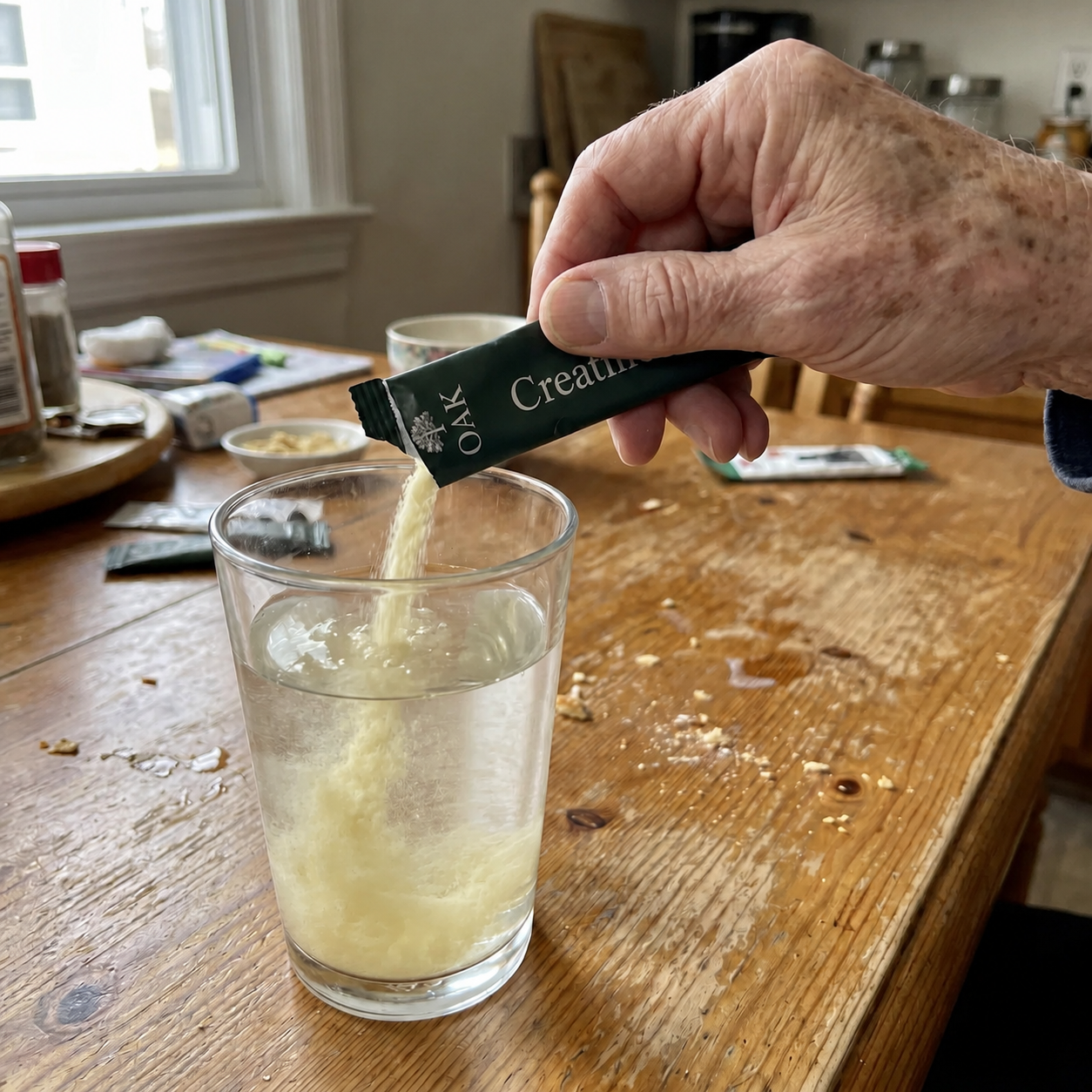
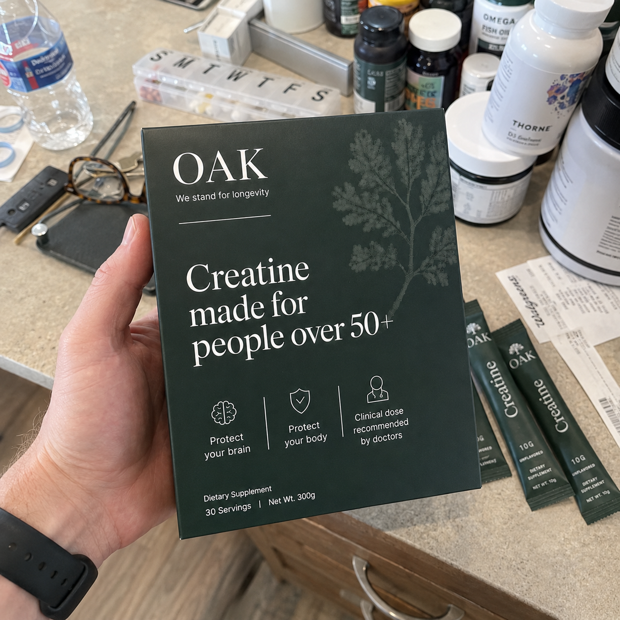
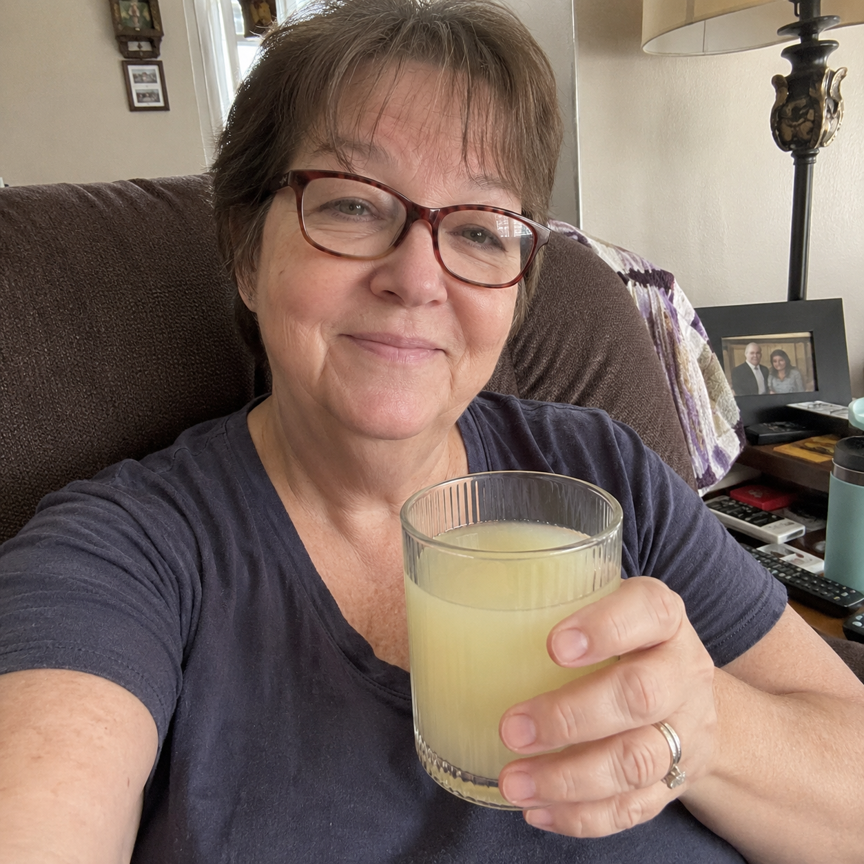
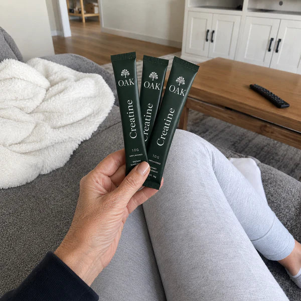
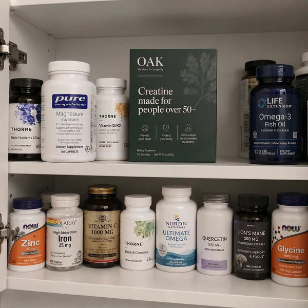
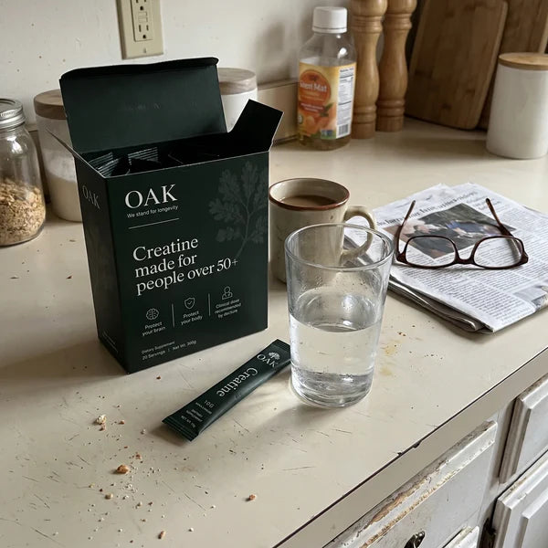
The natural ingredients behind the lemon taste — shot clean and close, warm and appetising. Use to prove purity.
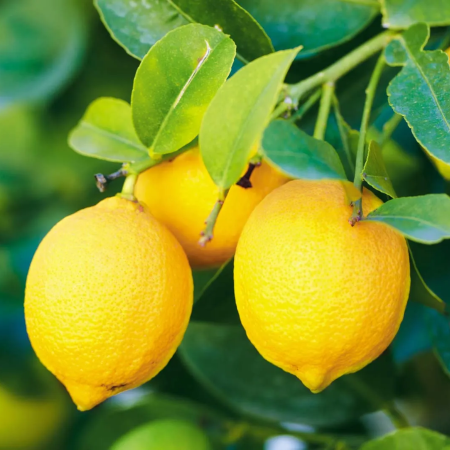
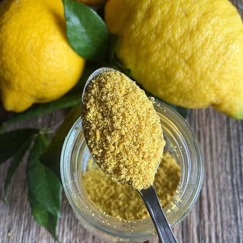
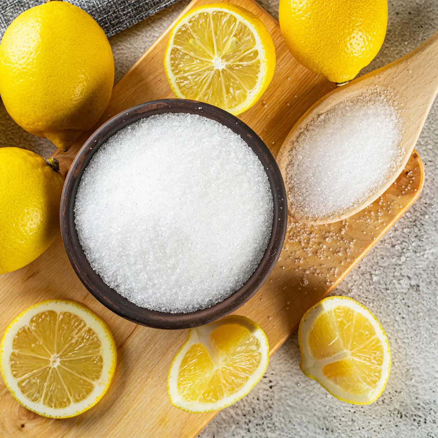
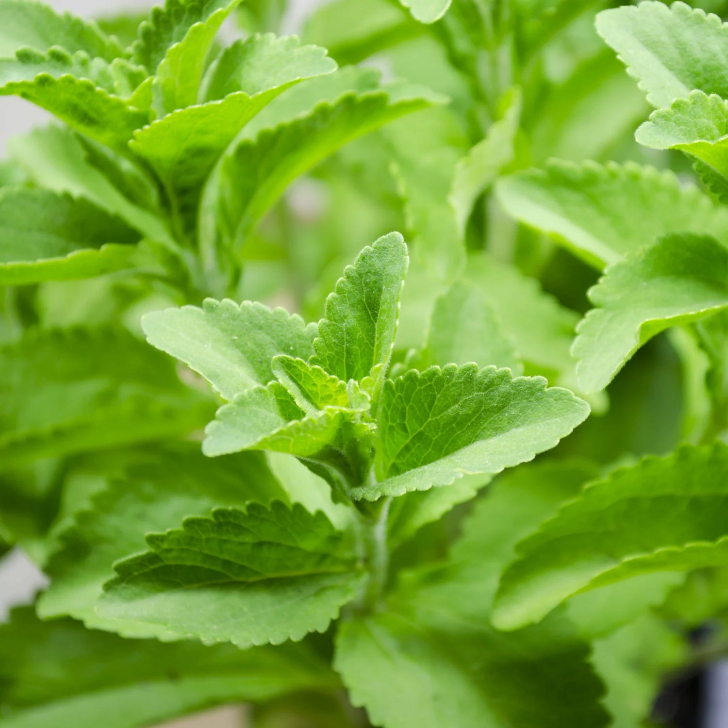
Clean studio shots on a soft neutral ground, in order of use. The drinking shot is the hero for ad generation of the product in use.
 1 · Tear
 2 · Pour
 3 · Stir
 4 · Drink · hero
Professional pack shots
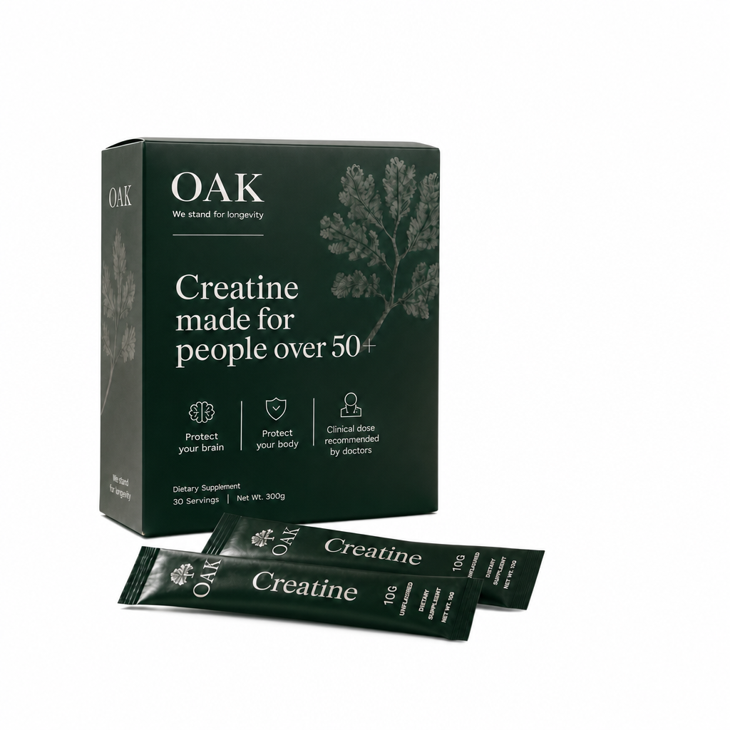
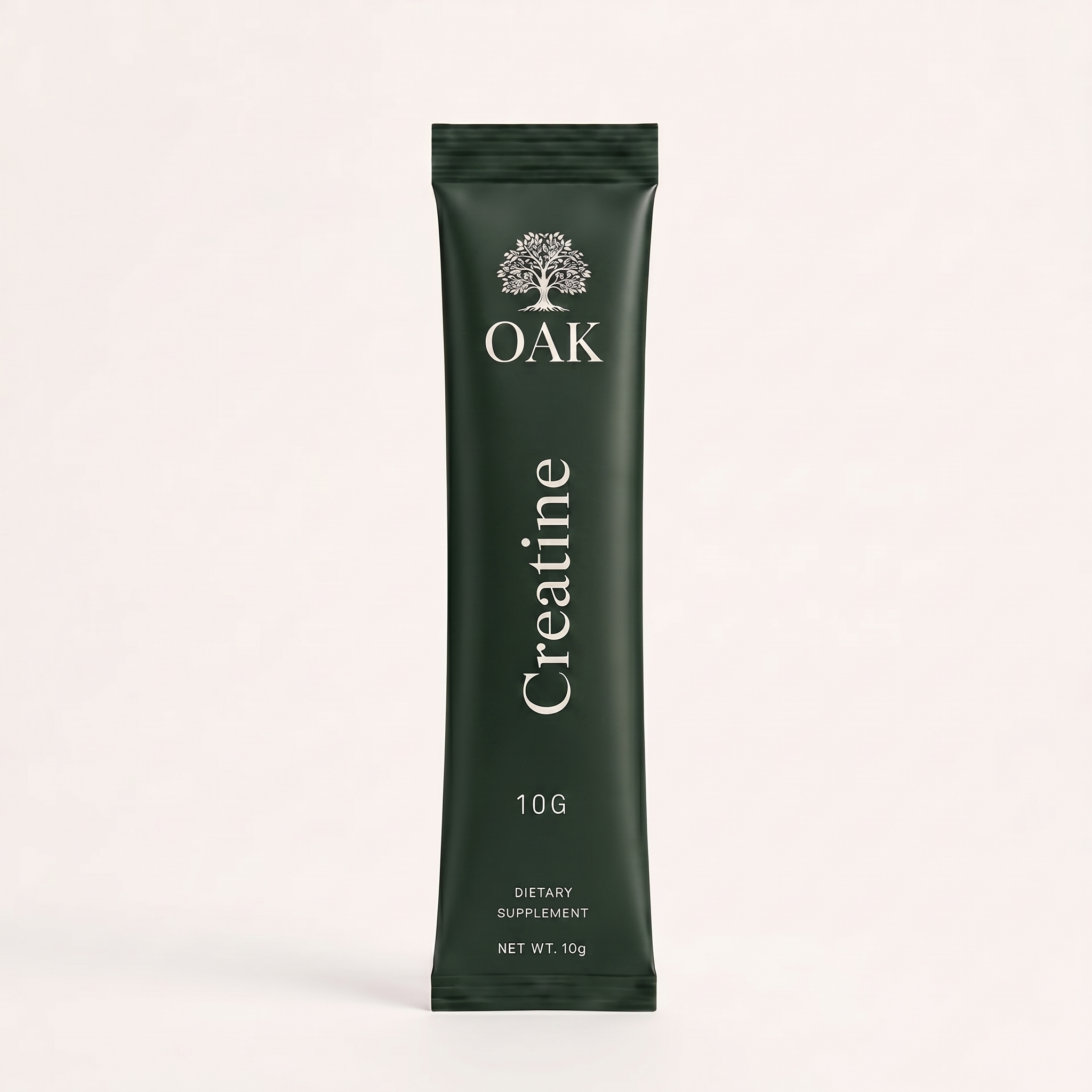
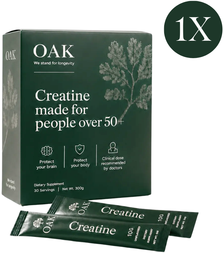
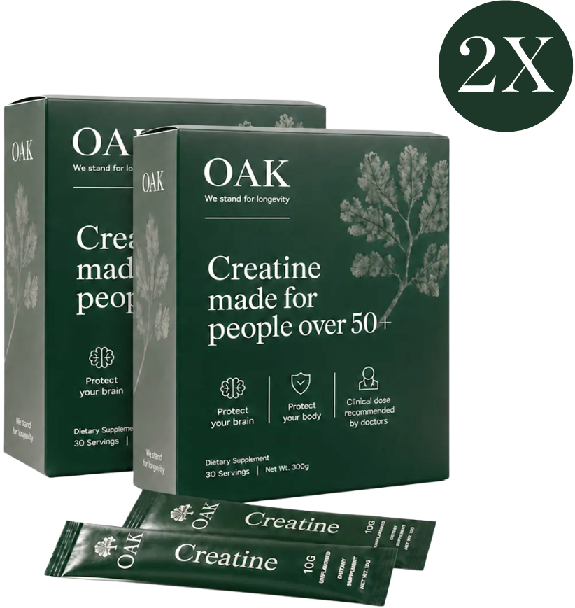
Clean, evenly-lit studio shots on white. The core hero, its variants (with/without glass or lemons), the single sachet, and the supply-bundle renders with the circular badge for 30/60/90-day tiers.
 Hero · front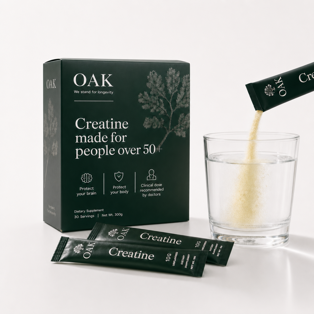
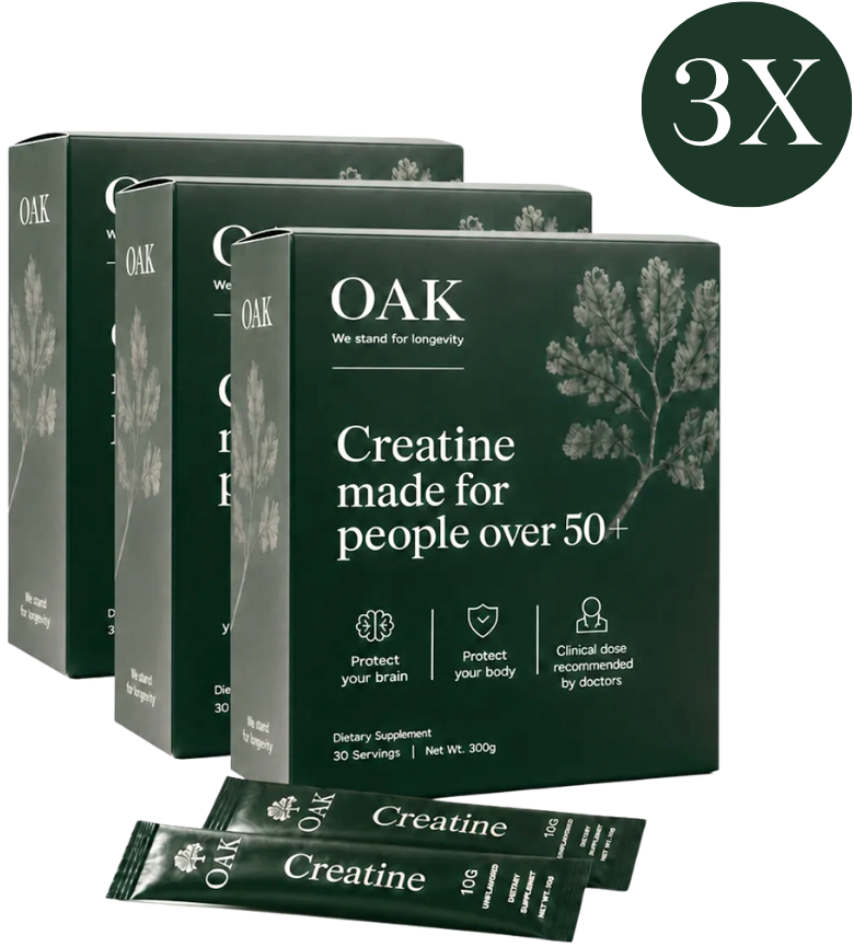
Live on-page visualisations
The signature building blocks from the product page — reference these when recreating or extending the site so new work stays consistent.
Research shows the best results in week 6 to 12.
Try OAK for 90 days, on us.
You'll get a science-based 90-day money-back guarantee. If you don't feel a meaningful difference within 90 days, we refund you in full. No questions asked.
Start your 90 days →

“I am 67 and I had started to think the brain fog was just something I had to accept. I was wrong. My word recall is sharper, I feel more present in conversations, and I am not writing everything down anymore because I actually remember things. My daughter noticed before I mentioned it to her.”

Thin, single-weight line icons (~1.5px), rounded, outline, monochrome. Always in a circular hairline outline for benefit blocks. Lucide is the stand-in until OAK's own SVGs land. No emoji.
Quiet and functional. Short durations (140 / 240 / 420ms), ease-out. Fades and gentle height/opacity. The scarcity dot pulses softly. No bounce, no spring, no decorative loops.
4px scale, generous 64–96px section padding, 1200px max (720px reading width). Radii 6 / 10 / 16 / 24, pills 999. Low warm diffuse shadow, 1px hairline border. No harsh shadows, no coloured-left-border cards.